Thursday, August 29, 2013

Dim Sum Spoonflower Contest

Please vote for my dim sum design in the weekly Spoonflower contest:

http://www.spoonflower.com/contests/209

Please only vote once. You can vote for as many patterns as you like!


365patterns dim sum spoonflower pattern

Tuesday, August 27, 2013

New homepage

I've switched my homepage hosting to Squarespace to better feature my artwork. Please check out my new site!

http://annkilzer.net/

And also take a look at the new Shop and Inspiration pages I've added to the blog.

Monday, August 26, 2013

Dim Sum - Final Draft

I did some minor touchups on my Dim Sum pattern and entered it into the weekly Spoonflower contest. Notice I made the basket tops alternate, I replaced one set of pork buns with another potsticker, and I spaced the sesame and pork buns further apart because there were too many white circles in the first draft.

Chicken Feet  dim sum 365patterns

Saturday, August 24, 2013

Dim Sum Repeat

Here's my progress on my Dim Sum pattern for Spoonflower's weekly contest. That's right, chicken feet, tripe, and pork bun! This contest has a limited color palette. Odd colors but I've kind of made it work.


Friday, August 23, 2013

Dim sum doodles

Tonight I'm brainstorming motifs for spoonflower's dim sum pattern contest. Here are chicken feet & a basket.

Thursday, August 22, 2013

Wednesday, August 21, 2013

Tuesday, August 20, 2013

Making repeat tiles using the offset method

Tonight I'm going to share with you how I created the basic repeat tile for my letters pattern. If you want to understand why this works, please see my post Tiling on a Torus or watch the related video.

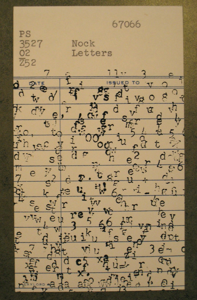
First I created a pattern using an old typewriter.


I photographed the image, opened it in illustrator, and used the Live Trace tools to vectorize it.  Then I created an artboard for my base tile. In this case I used a 600 pt by 600 pt square. I pasted letters over top and deleted all letters that did not touch the artboard. Notice that I left letters hanging off the edge of the tile. Call this layer "Original Artwork," lock it and make it invisible. I always like to make a copy of my artwork layer to be safe.


Optional Step: I created a new layer called "Guidelines" (I think I called it gridlines in the picture below, forgive me). To align the guidelines perfectly to the center, I create a rectangle half the height and width of the artboard. In this case it would be 300pt by 300 pt. I use the alignment tool to put the rectangle in any corner. Then, make sure you have rulers visible and "snap to point" enabled (Both are under the View menu in CS6. Now drag your guidelines so that they touch the side of the smaller rectangle. Delete the rectangle and lock the layer. Now you have guidelines showing the centerlines of your tile.


Now return to your original artwork. Select everything, group it, and copy it. Lock your original artwork and make it invisible.


Move to a new layer. Let's name it "Pattern." Click Command+F (or Ctrl+F on Windows) to paste in front. While everything is selected, use the transform window to offset your artwork. We will offset the tile by half the width and half the height of the tile. So for the first offset, in the transform box, subtract half the width from the value in X and half the height from the value in Y. You can actually make Illustrator do the math for you. Say my rectangle is 600 x 600, so I can just type "- 300" in the X textbox and wait for the magic to happen.


Here's the result of the transform after moving -300 in both the X and Y direction. Notice that the letters that bled off the edge of the artboard cross the gridlines. This is fine.


Now fill the remaining quadrants using more transformations. Paste in front and adjust the X and Y values to move the image. Hint : My transformations were (X - 300, Y - 300), (X - 300, Y + 300), (X + 300, Y - 300), (X + 300, Y + 300)


Now it's time for what I call "mending the seams" (see Tiling on a Torus). Notice that along our guidelines, the letters that had overlapped the edges are now lying on top of one another. This makes the pattern too dense in many spots. I've highlighted some with red arrows. I deleted and adjusted the position of the letters to make the pattern look more even. 


Once you have your artboard looking more balanced, make a layer called "Invisible Background" and make sure it is the bottom layer. Create a rectangle the size of your artboard, and make sure this rectangle has no fill and no stroke. Align the rectangle so it's centered vertically and horizontally on the artboard. Then, make sure your layers Pattern and Invisible Background are visible and unlocked, and all others are locked. Make sure the swatches window is open. Use the black arrow to draw a selection box around the artboard. Then, drag the selection into the swatches panel. The invisible background tile tells Illustrator where to cut the pattern tile.

Make a new rectangle off to the side of your workspace, or on a new artboard. Ensure the rectangle is much larger than your repeat tile. Select the rectangle, and fill with your pattern swatch.

Look at the pattern. Blur your eyes and see if it looks uniform. Are there areas that are too dense or too sparse? You may need to rework your repeat tile.


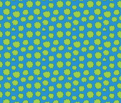
It's an iterative process, but patience will bring you better patterns. Here's an intermediate revision.


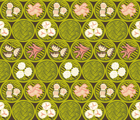
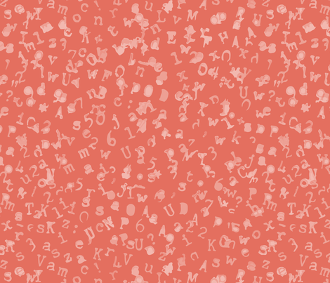
Here's the final version (many iterations later!)


I hope this is a helpful resource and would love feedback on how to make it better. Questions are welcome :)


Monday, August 19, 2013

Summertime Cool Collection on Spoonflower

Tonight I uploaded the rest of my Summertime Cool Pattern Collection to Spoonflower. I have ordered proofs which should be here just in time for summer to be over... now I understand why the fashion world works at least six months ahead.  Anyhow, I'm excited to have a cohesive body of work, so I hope the proofs come out nicely.

Pollens: Bright Sunny Day

Raindrops: Tidepool

Pollens: Orange

Sunday, August 18, 2013

Letters on Spoonflower

I've added the finishing touches to my letters patterns, and they are now uploaded to Spoonflower. Once I proof them they will be available as fabric and gift wrap.

  Grape Soda Letters typewriter 365patterns

Blue and Purple Letters 365patterns


Tide Pool Letters 365patterns typewriter

Friday, August 16, 2013

Postcards Arriving!

The postcards from the 365 Days of Pattern postcard project were mailed out last week, and now I'm receiving pictures of the postcards at their final destination. Thank you to all participants, and feel free to send me pics if you ordered a postcard!

Spokane, Washington

Missoula,  Montana

Thursday, August 15, 2013

Working small

Tonight I decided to look to the web to find a new way of making patterns. I came across a cool website called patternify.com that allowed me to make small tiled repeats by manipulating pixels:


Wednesday, August 14, 2013

Zilker

Today's prompt is to use an anagram of your name. My last name Kilzer can be rearranged to spell Zilker, which is the name of a park in Austin famous for its annual kite festival. Here's a quick sketch of a kite pattern:

Tuesday, August 13, 2013

Monday, August 12, 2013

Sunday, August 11, 2013

Saturday, August 10, 2013

Time warp: Static Letters

I bought this typewriter for $1.50 at the Salvation Army in Spokane Washington in the spring of 2004. I was in a bad mood after meeting a rather unpleasant guy, and decided to buy a few odds and ends for creative inspiration. The typewriter is in working condition, and I used it in several art projects. In addition to drawing it, I used it to create textures by typing.


"Autobiography" (2006): Photoplate Lithograph with Watercolor


A card from "Outcasts" (2006): Silkscreen on found library cards

Okay, many good memories with this typewriter. Tonight I repeated the process to create the letters texture. It took me about two hours of pounding on keys and feeding the paper through the typewriter at different angles five times. Odd numbers are intentional.


The end result is an even texture, where the letters jitter like static on a television. Of course, a lot goes through your head when you're doing a monotonous physical task. To me, this piece represents randomness, chattering, static, and background noise.


Here's a Vine of me typing:

Tuesday, August 6, 2013

Flames colorways

Here are some quick colorways I did for my flames pattern. The third one is my favorite.


Monday, August 5, 2013

365 Days of Patten Postcard Project: Ready to Mail

I've got lots of people signed up for my postcard project, and I'm preparing the postcards to be mailed. Some are going to friends in the US and others are going to faraway places like the UK, Thailand, and Brazil. I hope those of you who receive postcards will send me a photo when you receive the card. I am interested to see how the artworks change after a long journey through the mail.


$.33 sends a postcard within the US. $1.10 sends a postcard overseas.


They're all addressed, stamped, and ready to go!